SKITTLES
1) What key conventions of print adverts can you find and what are the connotations or deeper meanings of each convention? For each convention, write about how it communicates meaning to the audience. See the Maltesers advert above for an example of how to do this.
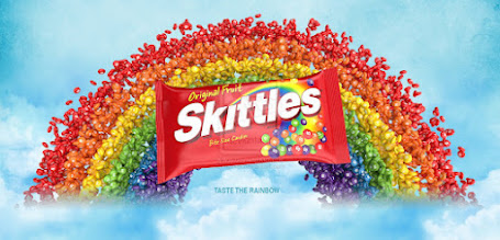
Colour scheme:Red,Yellow,Blue,Green,Orange,White,Purple. Skittles use a variety of different colours so its easily recognisable to their consumers.
Background: The background shows a group of skittles soaring around the sky to display an idea of what people might feel when they taste the sweets(out of this world).
Logo: The logo is bold, large and is focused right on the centre of the advert.This is an attention grabber to make people notice the brand.
Slogan: The slogan is at the bottom of the advert and is rarely visible. 'Taste of rainbow'
reinforces the USP because 'rainbow' reefers to the vibrant sweets on the background.
Picture: Picture of the product(skittles) reminds us of what type of product it is e.g chocolate
2) What is the USP (unique selling point) for Skittles and how do you know? Does the advert use any of persuasive techniques listed above?The USP for skittles is that

Comments
Post a Comment